
The psychology behind onboarding
Background
We had noticeable drop-off points in our app onboarding, so we set out to create an experience that would get more users from download to first payment.
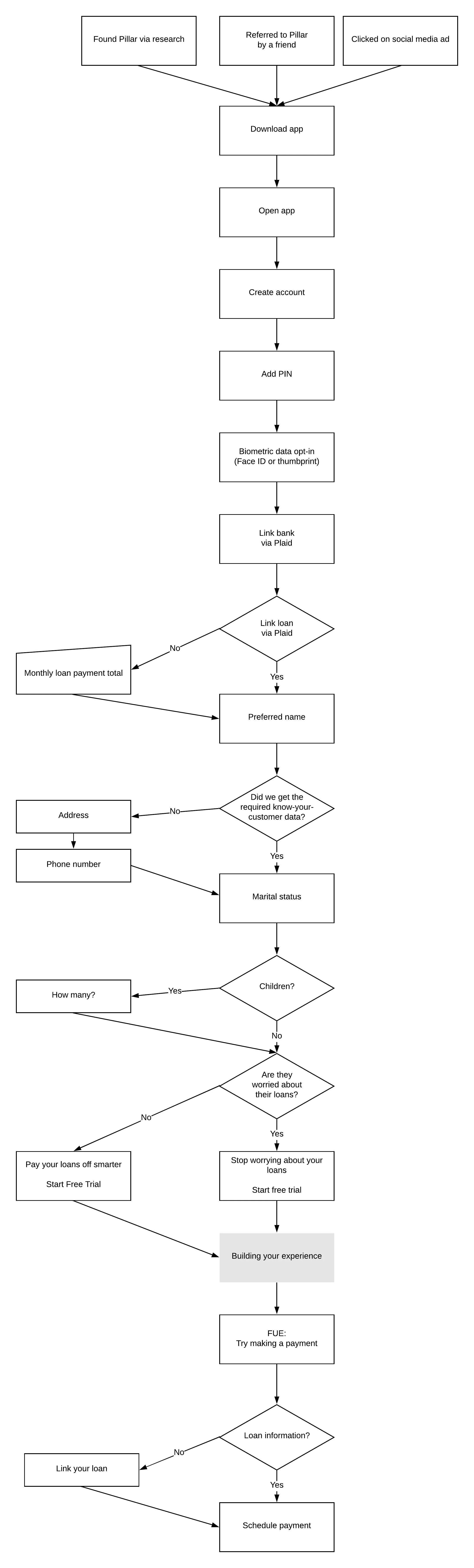
The Pillar user journey
When approaching an onboarding redesign, I used this user journey the Pillar team created from initial research.
Mapping out the best experience
We needed certain user information to generate accurate repayment recommendations, as well as information we were legally required to have as a financial entity. We knew the order of questions would be important to avoid drop-off and general user frustration.
User-friendly requirements

One of our main points of drop-off was the app home page. Users would open the app, and then decide not to proceed. We had two main hypotheses as to why: 1) The styling on the homepage was not in line with what was in the App Store or Google Play and 2) We had been focusing on speed rather than the emotional aspect of control.

To give users confidence their information would be safe, we added a mandatory account PIN that would be used to access the app as well as the option to log in using biometric data.

Before asking users to link external accounts, we wanted to once again remind them of why they downloaded Pillar in the first place—hoping that it would remove any hesitations to proceed.
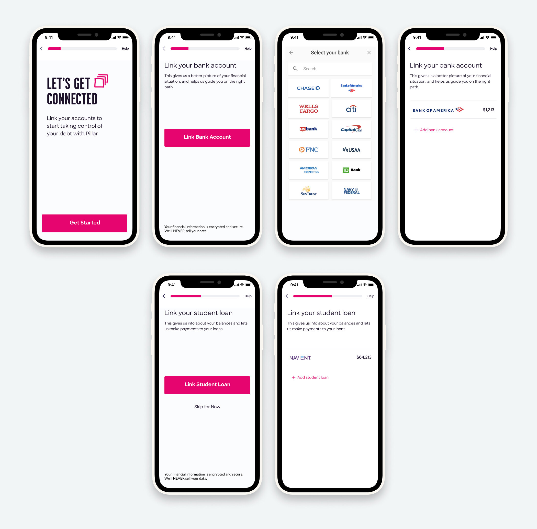
We intentionally moved account linking up in the process for 2 reasons:
1. We saw a trend in customer service emails from users with unsupported banks and loans. When account linking was at the end of the experience, they often felt frustrated that they had given us personal information like name and address and then been unable to use the app. We wanted to avoid alienating customers who could potentially use our app in the future.
2. When harder tasks are near the beginning of an experience vs. the end, a user is more likely to remember that experience as pleasant. Account linking is the most difficult part of onboarding, as it requires you to remember passwords. We get the hard work out of the way up front, and then it is all smooth sailing.
Student loan linking was our second biggest point of drop-off. We plan to make this optional, and allow users to link their student loan as part of their first payment.
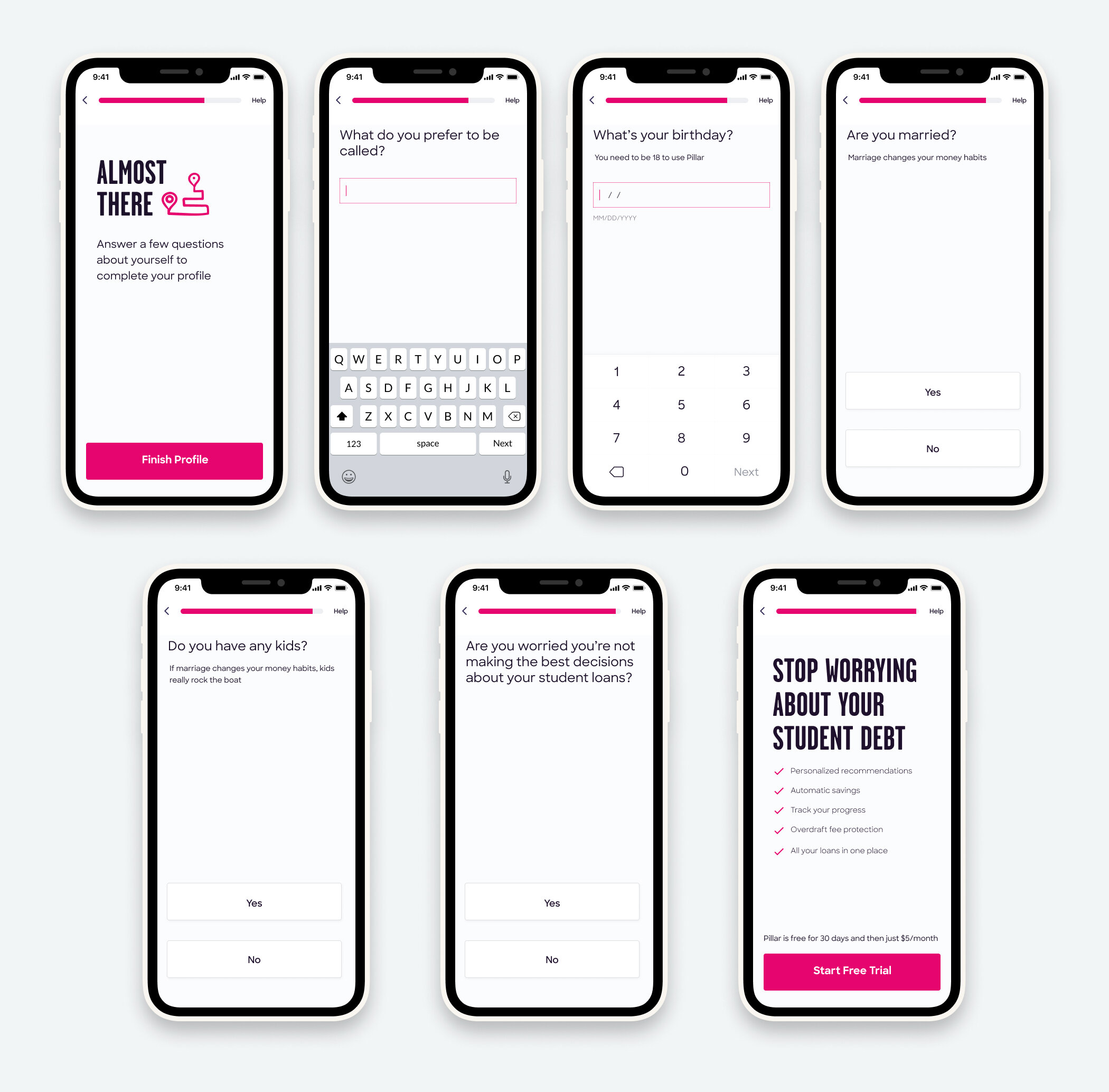
The last bit of onboarding is majority yes/no, which not only reinforces the ease of onboarding, but also collects information we need to generate payment recommendations.
The last question, “Are you worried you’re not making the best decisions about your student loans?” is being run as a test to see if aligning with a user’s unease about student loans can increase conversion.
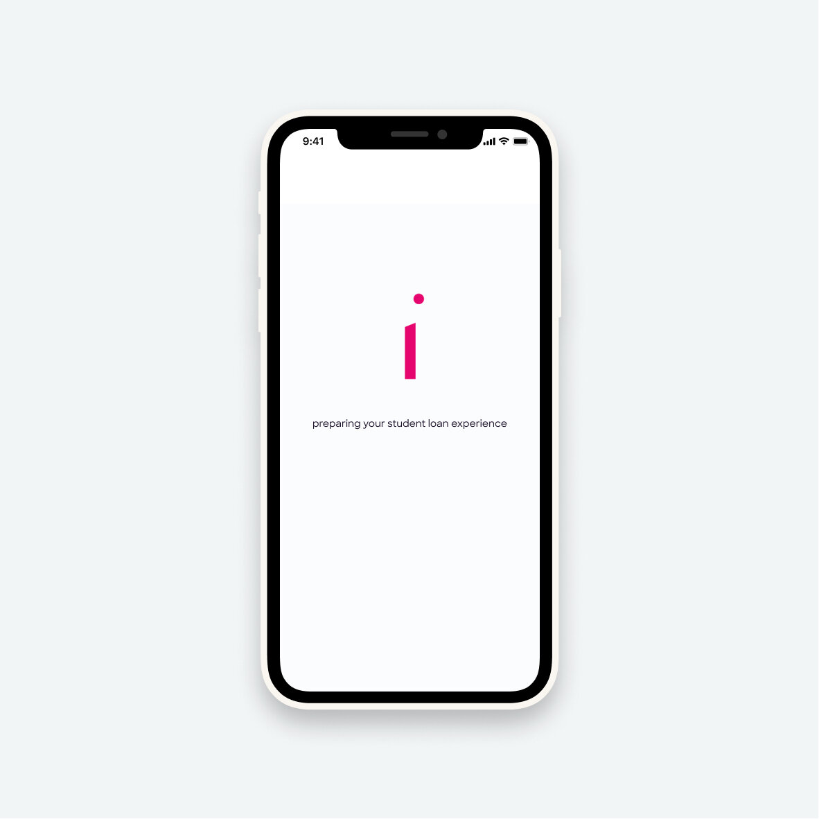

After the free trial we introduce a “building your experience” loading screen. The more work a user thinks Pillar is doing on their behalf, the more likely they are to value the experience.

When first-time users land on their overview screen, they see two main cards: an option to try it out and an option to play with a calculator.
Before these cards existed, we noticed a trend that users who set up recurring payments, often first made a small one-time payment to see how Pillar worked.

After a user has made a payment, they see how much they are on track to save.
Previously the loan balance had been the stat given the most weight, but in testing, users often found this to be demoralizing. Instead, we wanted to focus on something positive!
Results
With this redesign, we saw a 20% month-over-month increase in conversion.
More Case Studies
-

A human-centered approach to EHRs
-

Building a scalable documentation system
-

Accelerating therapist onboarding at UpLift